4 Techniques to Improve Mobile Checkout

The average cart abandonment rate is 69.89%. Of the number of people that make it all the way to checkout, 25% will leave without completing their purchase.
Whichever way look at it, that’s a sizeable number of lost customers and revenue. What’s more, the situation is even worse on mobile. Overall ecommerce conversion rates usually lag around two percentage points behind desktop.
So how can you go about recouping some of those sales?
Top companies have cut down their checkout abandonment rate to around 13%. And the simple truth is there’s nothing particularly complex about the tactics they’ve used.
By avoiding a handful of common mistakes, and making a few minor tweaks, you should be able to bring your own rate to a similar level.
1. Slash the Number of Steps to Complete a Transaction
If you look at Crutchfield’s checkout process, you’ll see that customers only need to move through three stages to make an order. It’s worth attempting to achieve the same number of steps (or even less) with your own checkout process.
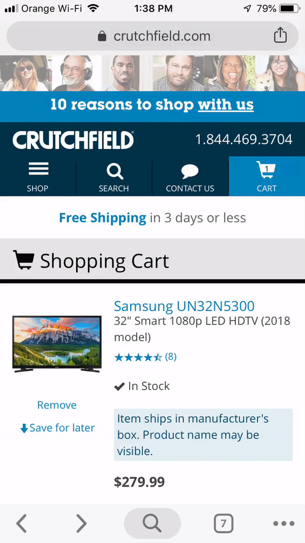
Crutchfield’s checkout process is made up of only three steps.
There is one caveat, however. On mobile devices, it’s better to fit all information into one screen-sized page. If that means more than three pages, then it’s a trade-off that’s usually worth making. Making customers scroll up and down can add unnecessary friction to the buyer journey.
2. Minimize Unnecessary Page Elements
During the checkout process, you have one aim – to close the deal. Checkout pages are not the place to promote your upsells and cross-sells. What’s more, unnecessary page elements, that might cause a customer to click through to another area of your site, should be minimized.
This is especially the case on mobile, where space is at a premium and it’s easy to accidentally tap the wrong button.
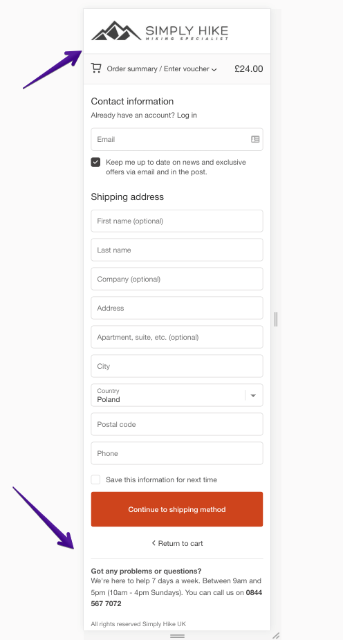
Simply Hike removes all unnecessary elements including the menu and footer. It just leaves the logo, performance indicator and phone support.
Some online retailers, like Zappos, have gotten rid of everything! If you want to go down that route, however, testing is a must!
If you need to include extra information, do so in the form of toplayers (top-of-the-page pop-ups) that will open a new window when clicked.
3. Make the Most Important CTAs Easy to Click
Or, even better, place them strategically while making them easy to click.
Scott Hurff created a “Thumb Zone” map that shows the spots to avoid when deciding where to place your crucial elements. Ensure you avoid the hard-to-click areas.

Use Scott Hurff’s “thumb map” when designing your pages.
What’s more, remember that visitors use their left hand to operate their mobile devices 30% of the time. Also, keep in mind that left-handers constitute around 10% of the population.
So don’t put everything on the right-hand side of the screen!
Which hand do you use for your smartphone when you drink a coffee or eat a donut?
So how do you put these points into practice? We recommend you follow three tips:
- Avoid placing elements you want users to tap in the upper part of the screen. Follow the “thumb map” above”
- Make all tappable elements, like buttons or form fields, screen-wide.
- Make sure your CTA buttons are colorful and stand out.
- Don’t force users to tap precisely on checkboxes when subscribing to a newsletter or agreeing to the terms and conditions — make the whole line tappable (if they tap on the instruction, for example).
4. Offer Guest Checkout First
Enable guest checkout and place the CTA strategically. Unless 90% of your users are returning shoppers, the guest checkout button should be one of the first options during the checkout.
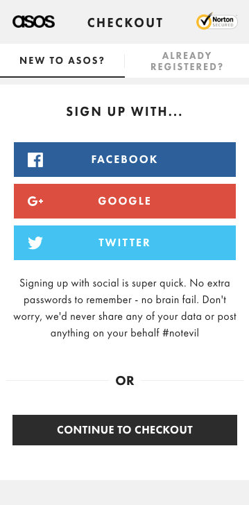
At Asos.com you can choose whether to register or simply continue to checkout.
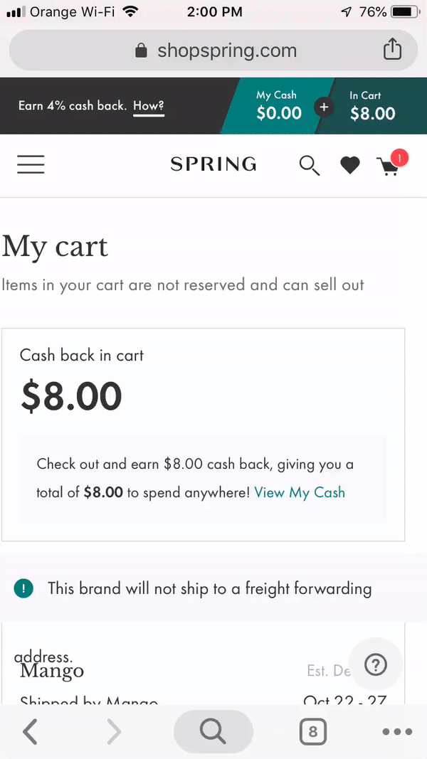
Here’s a pro tip. Copy Spring and ask for an email address before letting a user proceed. This way, you can reach potential customers if they do abandon their cart during checkout.
Conclusion
If there’s one thing you should take away from this post, it’s the simple maxim that “less is more” when it comes to customer checkout.
You want users to undertake one (and only one) action – and that’s to complete the purchase! Anything that prevents them from doing this should be dropped!
And, as always, don’t forget to test the results of all the tweaks you make. While these tips will set you in the right direction, consistent testing will enable you to find your own winning mix!
Are you looking for more ideas to grow your ecommerce conversion rate? I bet you do! If I bet right, you should get our Ultimate 115-point Ecommerce Optimization Checklist which we use with our clients to dramatically increase their conversion rates and sales.
About the author:
Pawel Ogonowski
The Ecommerce Optimization Guy who helps 7 & 8-figure online retailers get guaranteed revenue uplifts in a dev-free way. To get more of Pawel’s content subscribe to Growcode’s Ecommerce Optimization Blog and Bite-size Ecommerce Optimization on YouTube. Connect with Pawel on LinkedIn, Twitter and Instagram.